Growing up, I loved drawing and making collages. I wanted everything to be colorful, white space in the background meant I wasn’t finished. Even when taking notes in class the white space was calling me to be colored in. But is white space actually a good thing when creating eye-catching ads? My younger self would’ve said HECK NO, but now I have a completely different viewpoint.
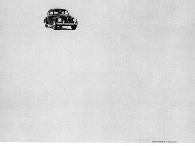
All through college, there was one advertisement that was mentioned in every advertising class I took (I’m not joking, I can quote the whole thing). Can you guess what it is (THINK SMALL)? That’s right, it was the Volkswagen Think Small campaign. The whole ad was made up of a Volkswagon off centered with a white background; the bottom had some text about the car and why you needed it. That was it. This advertisement changed the whole game.
So what’s the deal? Why did this change everything? It’s really simple, the white space! Our eyes are actually attracted to the white space because it gives us something to focus in on without any other distractions. It also adds a luxury and elegance to the product (thanks to the think small campaign). The next time you find yourself needing a new ad, think small. You never know how big it can grow.

Feb 10, 2017
Rachel Welton
0
1692
Think Small

#WhatAreHashtags and why are they so important?
If you have personal social media pages or if you interact with social media from a business perspective, then you cannot avoid hashtags. They seem to accompany every post and sometimes do...
Aug 24, 2017
The Importance of Having a Website
Even if your business has existed for many years without a website, there are many benefits to getting one up and running in today’s economy. A website can help a...
Aug 09, 2022